A New Vision – Grace Optical
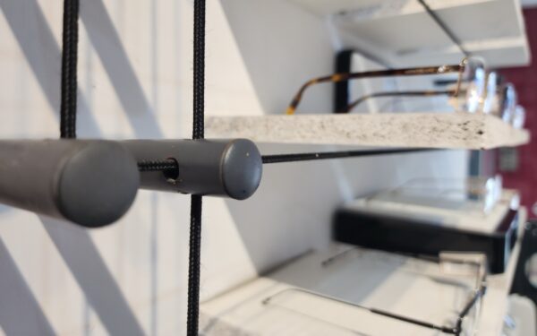
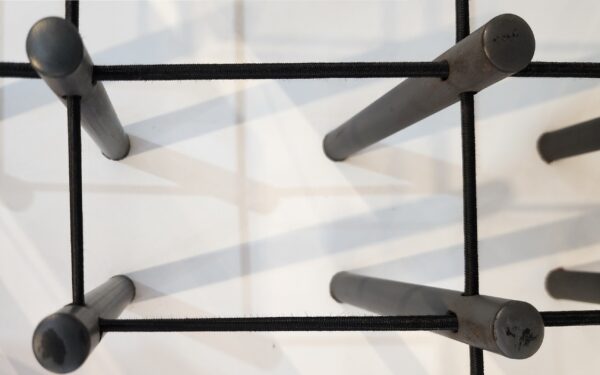
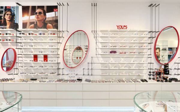
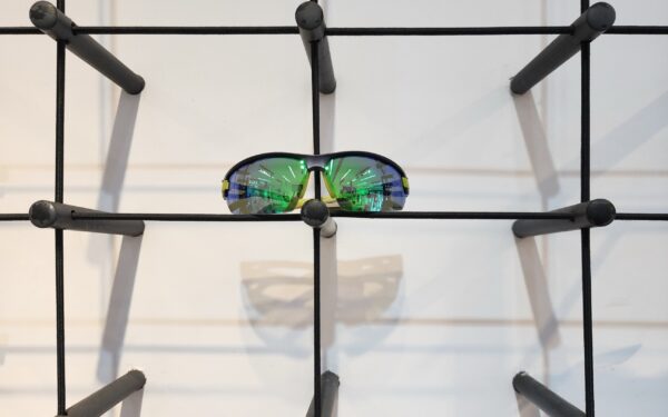
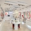
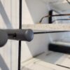
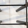
此空間設計的創意展現了現代感與品牌個性的完美融合。設計師利用運動彈力繩拉出水平及垂直的線條、並透過彈力繩對顧客傳遞年輕化的運動風格,及商品搭配上的彈性。
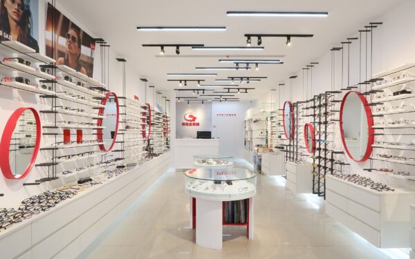
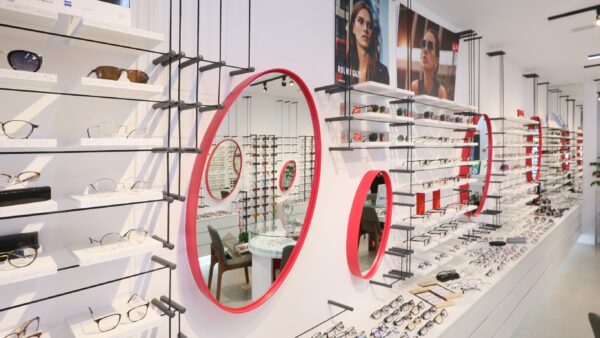
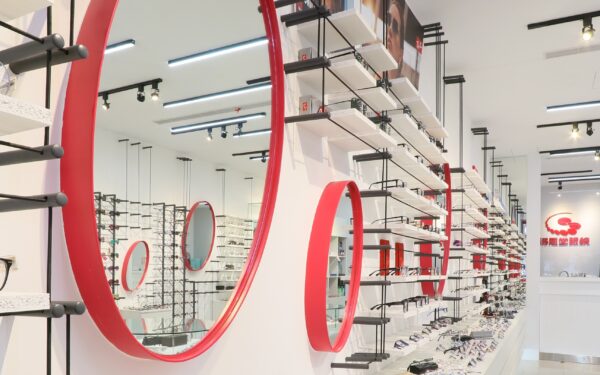
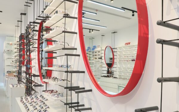
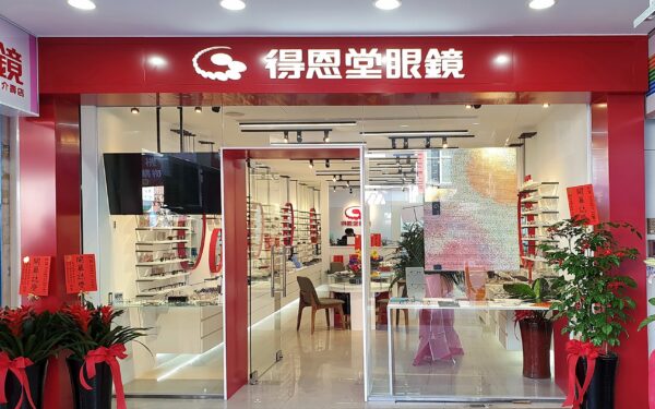
簡潔的色彩,搭配精準的材質挑選,打造出富有活力和機能性的空間。在線條上,運用了大量的垂直和水平線,利用展示區黑色金屬支架形成明確的幾何結構,營造出高度整齊和秩序感的視覺效果。這些垂直線條同時引導顧客視線沿著牆面延伸,使產品陳列更加集中且易於瀏覽。
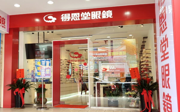
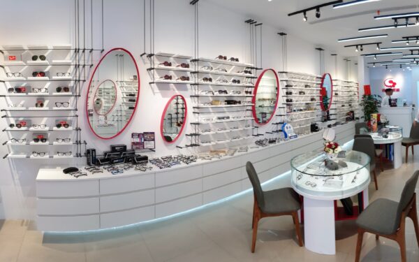
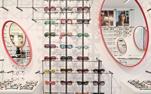
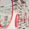
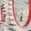
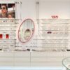
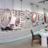
顏色方面,整體以白色為基調,輔以品牌標誌性的紅色點綴,形成了視覺上的焦點。金屬框紅色圓形鏡子不僅呼應了品牌識別,還在視覺上為空間增添了跳躍感和趣味性。這些圓形元素柔化且平衡了整體設計中的硬朗線條,讓顧客在空間中感受到活力與親和力。黑白色的搭配增強了空間的現代感和簡約風格,形成了時尚與專業的形象。
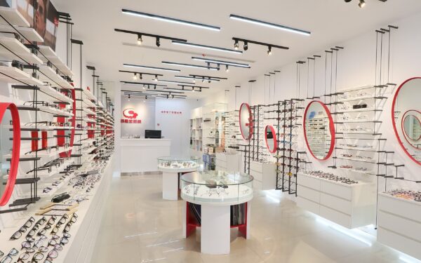
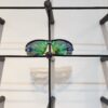
材質選擇上,大理石地板賦予了空間一種奢華感,光滑的表面能有效反射燈光,增強了整體的明亮度。展示架採用黑色金屬和白色木質,既具有現代感又保持了穩定性,滿足了展示和功能需求。圓弧形玻璃抽屜展示櫃則進一步提升了商品的展示效果,三芒星設計的支撐座同時兼具商品型錄收納量又不阻礙視覺通透性。
設計元素上,除了簡潔的展示架與圓形鏡子,燈光設計也是一個重要亮點。天花板上的線性燈光沿著展示區域安裝,強調了產品的展示,同時保持整體空間的清晰明亮。懸浮式展示櫃下隱藏LED燈光自然地形成無邊際效果,進一步放大了銷售空間,更直接將商品推送至顧客眼前,使顧客在選購商品時有更好的視覺體驗。
在設計概念方面,這個空間力求實現功能性與品牌形象的完美結合。設計師透過簡約的線條和清晰的動線,傳遞了品牌年輕化及彈性搭配的訴求,確保顧客能夠輕鬆瀏覽和體驗商品,而色彩和材質的選擇則進一步強化了品牌的時尚與專業形象。
挑戰主要來自於如何在有限的空間內創造出舒適的動線,同時展示大量的產品。設計師透過無邊際概念,利用垂直及水平線條做視覺延伸,與牆面同色的展示架刻意弱化空間的多層次,成功地解決了這一問題。橢圓明鏡的設置穩固了紅色與白色的企業識別系統,不僅優化了空間的利用,還增強了空間的視覺寬敞感。
這個設計的價值在於它不僅提升了品牌的視覺識別度,還透過功能性布局優化了顧客體驗。設計師成功地將現代簡約的美學與實用需求融合在一起,為消費者提供了一個既舒適又具有吸引力的購物空間。
English Design Description
This space design blends modern aesthetics with brand identity, resulting in a dynamic and functional environment. The designer uses clear lines, clean color schemes, and precise material choices to create a vibrant and efficient space. Vertical and horizontal lines dominate the structure, with black metal frames forming clear geometric shapes in the display areas. This creates a sense of visual order and symmetry. These vertical lines guide the customer’s gaze along the walls, allowing the products to be more prominently displayed and easy to browse.
In terms of color, the space is predominantly white, accented with the brand’s signature red, creating visual focal points. The red circular mirrors not only reflect brand identity but also add an element of playfulness and vibrancy. These circular elements soften the otherwise rigid lines in the design, infusing the space with energy and a sense of friendliness. The combination of black and white further enhances the modern and minimalist aesthetic, conveying a sense of style and professionalism.
Material selection also plays a key role. The use of marble flooring adds a luxurious touch, while its polished surface reflects light to increase the overall brightness of the space. The display racks, made from black metal and white wood, strike a balance between modernity and stability, fulfilling both display and functional needs. The glass cases provide transparency, enhancing the product display without obstructing visual flow.
In terms of design elements, the minimalist display racks and circular mirrors are highlights, but lighting design is another key feature. Linear lighting along the ceiling runs parallel to the display areas, emphasizing the products while keeping the space clear and bright. Hidden LED lighting further enhances the product display, providing a better visual experience for customers.
Conceptually, the space strives to integrate functionality with brand image. Through simple lines and a clear layout, the designer ensures customers can easily browse and interact with the products. The choice of colors and materials reinforces the brand’s fashionable and professional image.
One of the design challenges was to create a comfortable flow within a limited space while displaying a large number of products. The designer addressed this by using vertical display racks and mirrors to optimize the space, making it feel more spacious and open.
The value of this design lies in its ability to elevate brand recognition while optimizing customer experience through a functional layout. The design successfully merges modern minimalistic aesthetics with practical needs, providing customers with a shopping environment that is both comfortable and visually engaging.

商品評價
目前沒有評價。